You have just 90 seconds to make a connection with your patients
let your colours speak for you!
Colour Me Healthy!
Picture this: You are travelling on a dull, rainy day. The skies, a monotonous, gloomy grey seem to match your mood. And there, over the next bend in the road, you suddenly spot a rainbow.
It’s a wow moment! Immediately your spirits are lifted. You find yourself smiling, feeling lighter, ready to tackle the unsurmountable. For that is the power of colour.
And if there is any country that intrinsically appreciates colour, it is India! Whether it is the beautiful ‘rangoli’ & “torans” at our doors or the bright silks we wear for festivals, I believe we are truly a colour-loving nation. In our culture, we associate colour with liveliness and celebration – just like in the festival of Holi.
In our culture, we associate colour with liveliness and celebration – just like in the festival of Holi.
Neutral no more!
There is strength in colour. This is a factor healthcare designers and architects should take cognizance of as they create the modern-day healthcare set-ups today.
For a long time, these places stuck to white when it came to their interiors. It was not just that the colour was preferred by doctors, it was also considered practical. To add to this, the western influence brought in the thought of a neutral colour palette, ascribing it with sophistication and elegance.
But while white may be considered pure, and preferred by doctors, from the patients’ point of view it was drab and uninspiring. Literally. Imagine staring at a stark, endless white space day after day, night after night…
Which is why, designers in this field should ensure they bring in colour, reducing the monotony and creating individuality. Right from the moment the patient enters the place.
Let’s lobby for lightness
One study conducted by Colorcom proved that people subconsciously judge a product within the first 90 seconds of being exposed to it, and 60%-90% of the time, this assessment is based on colours! When the human eye perceives colour a signal is sent from the brain to the endocrine system. This in turn releases hormones that can create a change in moods and emotions. Thus, colour plays a vital part in perception, especially initially, and can be used carefully to create the right responses.
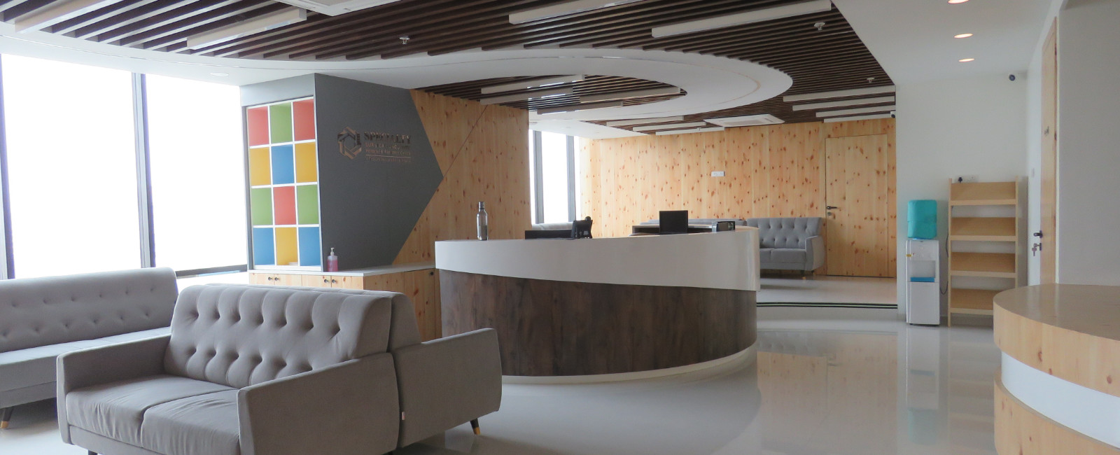
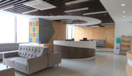
Hospital waiting rooms are usually the first interaction the patient or their visitors have with the place. Most hospitals and healthcare facilities overlook the importance of creating a warm and receptive reception/waiting area, when they actually should be focusing on this first!
Waiting rooms need to be airy and comfortable. Soft pastel colours with soothing warm earth tones of peaches / browns or cool palettes of teals / turquoise work well here. These colours either uplift the mood or soothe the nerves thereby calming and relaxing the patients.
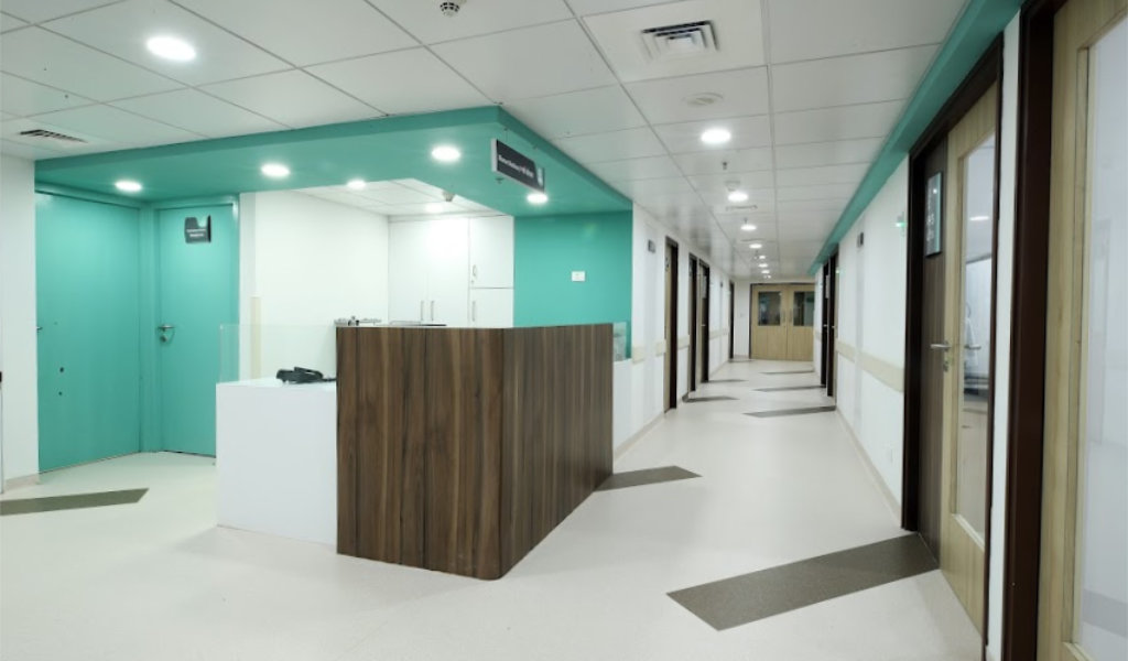
Colours can also be innovatively used in the corridors of healthcare centres to designate zones and give clarity to patient movement minimizing the dependence on signage. They can also be used on floors, ceilings or walls to give a sense of direction or a flow.

Room for calm
With its overload of medical equipment and other medical paraphernalia, patients often feel intimidated in hospital rooms. Just being in hospital can be an overwhelming experience, and a room with all these articles juxtaposed against stark, white walls will simply add to their uneasiness.
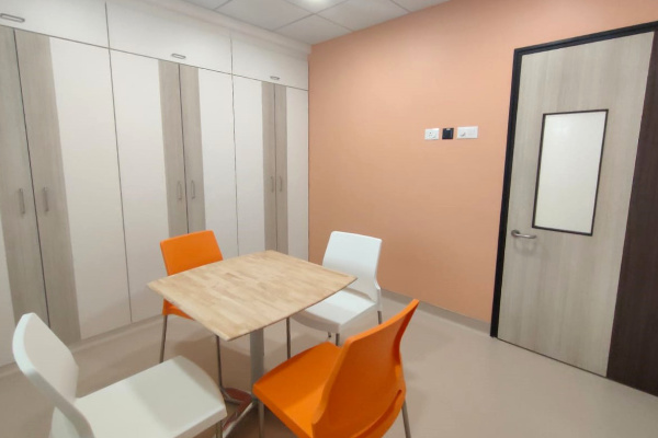
Creating a soothing, serene atmosphere is very important to patient recovery. Make patient rooms as pleasant and peaceful as possible. Soft blues and greens work best here – creating calm and promoting restfulness. Light peach / orange is another colour that can be used as it is felt to be nurturing and alleviates anxiety, as well.
There is a strong connection between nature and healing. However, space constraints and location may not make it possible to have every hospital room overlook a garden or scenery. Put your creative side to work here. Add artworks of forests, mountains or beaches. These scenic pictures have an equally beneficial effect.
Bright is right!
Children’s rooms and waiting spaces in hospitals should be bright, cheery spaces. They are the ones who react most adversely to their confinement, so the design of their rooms should focus on being fun. Colourful borders of cartoon characters or balloons, cute images of animals or birds, pretty kites and fluffy clouds…create a room that creates happiness!
Pushing for recovery
The aim of physical therapy centres is to help patients recover and be rehabilitated. This usually follows after stabilization of their diagnosis, and patients strive to increase their mobility, reduce their symptoms and improve their overall well-being.
With the intent to motivate physical movement, designers can use bright and bold colours that will energize and get the adrenaline going. While large areas should still be in relaxing colours, a feature wall could be painted in a bold red or fiery orange or a splash of colours. Colourful floor matting would also work here, encouraging patients to push themselves further as they exercise.
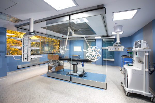
No entry for red
There’s a reason you shouldn’t use this colour in the design of an OT – surgeons and surgical nurses see enough of it on the operation table already! While earlier, the use of white was thought to neutralize the red, it is now understood that operating rooms must use subtle shades of blue or green on the walls to contrast against the red. Hospital scrubs are predominantly green or blue, so with white walls, surgeons would constantly see blue/green spots (called afterimages) when looking away from the operating table. Green/blue walls also help relieve the surgeons’ eyes, as opposed to stark, white ones.
Mission rejuvenation
We all know doctors and medical staff are an overworked, stressed lot. Their long schedules mean they are tired and need to be able to rest and recharge whenever they can. Brightly lit rooms with strains of strong colours like orange help them stay fresh and energized, especially when taking a quick break to unwind. When they are resting for a longer period, the room should have softer lighting, with muted shades of blue and green to promote balance and harmony.
The power of colour
The use of colour in hospitals and healthcare settings is also an important aspect of patient recovery. When going through their tests and treatments, it gives them something positive to look at and keeps their mood elevated.
Colour can add a fun element to the otherwise stark and (for some) scary hospital experience. Wall to wall landscapes, backdrops, murals, mood lighting are some ways to brighten up dreary hospital spaces. It can also keep the patient engaged.
Designers should bear in mind the effect of the 2 colour palettes – warm and cool. Yellow-Orange-Red-Pink constitute the former, and Purple-Blue-Green make up the latter. Generally, the warm palette is associated with creativity, energy, activity, etc., while the cool palette promotes calmness, healing, rejuvenation, etc.
Happy Designing!
Commonly used Colours in design are associated with following aspects or emotions

Related Posts

Ergonomics in Healthcare Design
Healthcare design is critical to creating safe and efficient healthcare spaces. Incorporating…
The Psychology of Style
The aesthetic appeal of our surroundings can have a profound effect on the way we feel. Research…
Neuroaesthetics in Architecture
Neuroaesthetics is an evolving scientific arena which explores how our perceptions, thoughts and…