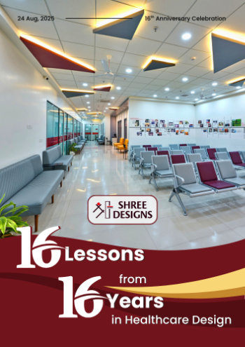
The Role of Textures in Inviting Healthcare Spaces
Why good design is more than colour and furniture—and how texture shapes patient perception, staff wellbeing, and compliance
“When we begin any hospital or clinic project, one of the first things we hear from clients is: – We want it to look clean, but not cold.”, says Kshititi Nagarkar, Shree Designs.
That sentence says a lot. Doctors, especially those setting up smaller hospitals or diagnostic centres, are acutely aware that healthcare spaces must be sterile and high-performing, but they also want to build trust and comfort the moment a patient walks in.
This is where texture becomes a silent but powerful design tool. It influences how a space feels—subconsciously communicating warmth, care, or in some cases, even detachment.
In this blog, we share real design decisions from our projects, backed by technical considerations, and lessons learned while working on healthcare facilities across India.
1. Texture as a Tool for Reducing Patient Anxiety
Imagine this: You’re setting up a compact OPD-cum-daycare unit. The waiting area is about 130 sq. ft.—functional, but tight. Patients often spend 30 to 45 minutes there before entering the consultation room.
As a care provider, you might worry: “Are patients growing more anxious here, even before the doctor has seen them?” That anxiety isn’t just emotional—it’s sensory. Enclosed spaces with glossy finishes, stark lighting, and hard plastic seating can amplify stress, especially for those already unwell.
Here, we could suggest a textured wall film behind the reception, matte-finish paint on other surfaces, and soft-touch, non-glossy seating fabrics. The flooring could be a low-sheen terrazzo-style tile, not polished granite.

Here’s why this could help: Glossy surfaces create glare and visual harshness, which can trigger sensory discomfort, especially in neurology, mental health, and pediatric clinics.
Matte textures absorb light, reducing overstimulation and creating a grounded, calming effect, without compromising on cleanability or maintenance.
Technical Tip:
Always check the Light Reflectance Value (LRV) of your finishes. A range between 30% and 60% is ideal for patient zones. Too low = gloomy; too high = harsh glare.
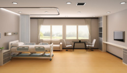
2. Material Selection: Where Texture Meets Performance
In healthcare interiors, not every texture is safe or permitted. We often meet teams who love a wood-panelled look or woven fabric walls… until we remind them that infection control, flammability ratings, and cleanability must be non-negotiable.
For a multispecialty brownfield upgrade, we were asked to design headwalls with a soft wood finish for ICUs. Wood veneer wasn’t feasible due to cleaning limitations. We selected a PVC laminate with woodgrain embossing, rated Class B1 for fire resistance and compatible with hospital-grade disinfectants.
Other textured materials we’ve used successfully in patient care areas:
- Embossed vinyl flooring (R10+ slip rating, easy to mop)
- Fabric-finish acoustic wall tiles (in admin and paediatric OPDs only)
- Micro-texture laminates for doors and cabinets (EN438-tested)
Easy Checklist:
When reviewing material samples, ask:
✔ Is this surface antimicrobial or easy to disinfect?
✔ What is the slip resistance and abrasion class?
✔ Can it withstand sodium hypochlorite or phenolic cleaners?
3. Using Texture to Zone and Guide Without Signboards
Let’s say a client approaches us with a common request:
“We want to separate our paediatric, gynaecology, and diagnostic zones in the new OPD wing—but we don’t want it to look like three different hospitals.”
In a case like this, rather than relying solely on signage or bold colour codes, we’d use texture as a subtle zoning tool—a way to guide movement without disrupting the overall design language.
Here’s how we might approach it:
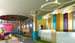
- Paediatrics: Install cork-textured LVT flooring that feels warm and forgiving, paired with padded vinyl wall bands to create a child-friendly, tactile zone.
- Gynaecology: Use soft fabric-print wall graphics and felt-textured seating to bring comfort and calm to the waiting area, which is especially important for anxious or expectant patients.
- Diagnostics: Choose sleek, low-maintenance stone-look tiles with satin stainless signage for a clean, clinical finish that communicates precision.
Why texture helps:
In high-traffic OPDS, especially where patients visit multiple departments, this kind of visual and tactile zoning naturally improves navigation. Patients, including the elderly or those with cognitive challenges, respond better to intuitive environmental cues than to static signboards alone.
“Texture can act as a non-verbal guide, improving patient flow while also reducing staff interruptions from people asking, “Where do I go next?”, continues Kshititi Nagarkar.
4. Reducing Fatigue in Staff Zones Through Sensory Relief
While patient comfort is often the primary focus in healthcare design, it’s important to remember that nurses, doctors, and technicians spend significantly more time inside the hospital than any patient ever will.
Imagine a hospital administrator asking us, “Can we do something different in the staff zones? Everything looks so clinical—even in the pantry.”
In a situation like that, we’d recommend introducing textural contrast in staff-only areas. Think linen-textured laminates for cabinets, soft cork-finish pinboards, or acoustic ceiling tiles with a tactile surface finish. These are all materials that remain compliant with hygiene protocols but feel noticeably different from the sterile environment outside.
Why does this matter?
Because even clean, smooth finishes—when repeated endlessly—can lead to visual and sensory fatigue. Giving staff a small space that feels texturally distinct allows for a mental reset, a moment of calm before they go back into high-stress zones.
Design tip: Treat texture like you would acoustic control—it helps reduce visual noise, improve focus, and support emotional well-being for caregivers.
5. Balancing Texture with Safety and NABH Compliance
A key challenge we often face is when doctors or promoters want high-end textures—leather panels, wooden slats, fabric walls—but haven’t accounted for compliance.
Every textured surface must be evaluated on:
🔸 Flame spread (ASTM E84 / IS standards)
🔸 Cleanability and chemical resistance
🔸 Infection control impact
🔸 Risk of dust/microbial retention
Safe zones for rich textures:
- Above dado level in waiting areas
- Non-clinical zones (meeting rooms, lounges)
- Administrative and counselling rooms
Avoid in:
❌ OT walls and ceilings
❌ Sterile prep and recovery rooms
❌ ICU bed backdrops without laminated surfaces
Pro Tip:
Ask your architect to create a surface material matrix showing what is allowed in each zone, as per NABH and infection control guidelines.
Final Thoughts: Designing with Texture is Designing with Intention
Textures may seem like a finishing touch, but in healthcare, they’re foundational to how patients perceive care and how staff feel at work.
At Shree Designs, we don’t treat texture as “decoration.” It’s a calibrated design tool—functional, compliant, and patient-focused. Whether it’s flooring that prevents slips or wall claddings that ease anxiety, we use texture to bring comfort to clinical spaces.
If you’re designing or renovating a hospital and want to explore how textures can enhance both compliance and patient experience, let’s start with a conversation.
Reach out to the Shree Designs team – we’ll help you build spaces that feel as good as they function.
Related Posts
Common Site-Level Mistakes in Healthcare Construction
In healthcare construction, site decisions become clinical decisions. Orientation, drainage,…

Negative Pressure Rooms in Hospitals
Negative pressure rooms (NPRs) may occupy a small footprint in a hospital, but their performance…

Designing for Night-Shift Healthcare Workers
Hospitals run 24/7, but most design decisions are made with daytime workflows in mind. We’ve been…

The Science of Hospital Windows
Windows in hospitals do far more than bring in light; they influence recovery rates, infection…

How Design Impacts Patient Care
Ever wondered what goes into designing a hospital or clinic that truly works - for doctors, staff,…

The Lifecycle of a Healthcare Facility Design
Ever wondered what goes into designing a hospital or clinic that actually works - clinically,…

Designing NABH-Compliant Hospital Interiors
A well-designed hospital isn’t just about aesthetics. From fire safety and infection control to…

Blueprint for Healthcare Design
From room dimensions to lighting levels, every detail matters in healthcare design. At Shree…

Building Better Day Surgery Centres
Efficient care, happier patients, and smarter workflows - this is what defines a successful…

Designing Healthcare Spaces That Truly Heal
From concept to completion, every medical space we design prioritizes patient flow, staff…

The Business of Wellness
In the $1.8 trillion wellness industry, first impressions matter. Patients don’t just choose a…

Efficient Hospital and Clinic Design
India’s emerging cities are growing rapidly, creating an urgent demand for accessible and efficient…

Creating Calming and Confidential Spaces for Fertility Clinics
As the demand for fertility treatments grows, the architecture of these clinics plays a vital role…

Designing the Perfect Hospital Pharmacy
Hospital pharmacies are the backbone of seamless patient care. From efficient workflows to secure…

Preventive Care Facility Design Strategies
With preventive care emerging as the future of healthcare, this post outlines key architectural…

Thermal Comfort Decoded
Thermal comfort plays a critical role in patient recovery, staff productivity, and overall…

Building for Tomorrow: The Imperative of Adaptable Healthcare Design
Healthcare facilities need to be as dynamic as the industry itself. Traditional, rigid designs can…

Designing Single Speciality Healthcare Centres
As single-speciality centres grow, their design needs become more specific, calling for tailored…

Innovative Design Solutions for Senior Care Facilities
Designing senior-friendly spaces in healthcare facilities is crucial for catering to the evolving…
Designing a Dental Clinic for Success
Providing quality dental care is not just about the technical elements of the treatment. It's also…

3 Essential Design Features for Intensive Care Units
ICUs are not just limited to single units housing all critical patients. If the facility has…

3 Lessons Learned While Building a Cardiac Cath Lab
Cardiac care design is moving at the sound of a new beat! The number of Cath labs in India has…
5 Essential Elements of Healthcare Design
Design makes a significant impact on the delivery of care for both healthcare providers and…
5 Best Ways to Create Healing Spaces for Kids
Designing spaces in healthcare facilities tailor-made for children is a lesson in balance! A…
Top 5 Trends in Healthcare Design
Design can make all the difference when it comes to improving patient care. From a patient’s point…

The Architectural Design of Hospital Facilities
Shree Designs designed and executed many efficient and safe healthcare setups in the middle of the…

Dauntless Designers
Healthcare Radius in its 7th Anniversary Special issue in October 2019, featured a "power list of…
The changing face of healthcare design
After completing a decade in designing healthcare projects, Kshititi Nagarkar, principal architect,…

Thumb Rules for Planning and Designing of Hospitals
Traditional rules of thumb in healthcare planning have changed. Once-accepted rules can now be the…